Landor Associates was founded by Walter Landor and his wife Josephine in 1941 and has grown to become one of the most important design companies in the world, responsible for literally hundreds of some of the most recognizable brands today. It is been especially prolific within the airline industry since it began working with Alitalia in 1967 and has created some of the most iconic airline identities.
On this page I use my collection of 1:400 aircraft models to explore year by year the airline brandings that Landor has accomplished.
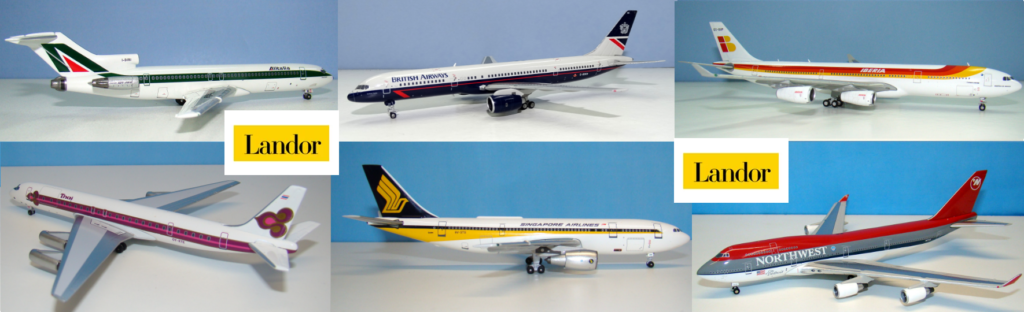
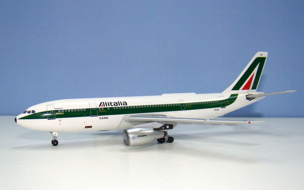
ALITALIA (1969)
A simple but bold stylised A in green, with a red centre, which fills the tailfin as a continuation of a green windowline. The A is repeated as the first letter in the black italic logotype on an all white fuselage. A variation with dark and light blue was used for subsidiary ATI.
SINGAPORE AIRLINES (1972)

Dramatic foreshortened cheatlines in yellow and dark blue below blue titles. A large yellow stylised Kris dagger / bird motif is on the dark blue tail and repeated in miniature on the engines.

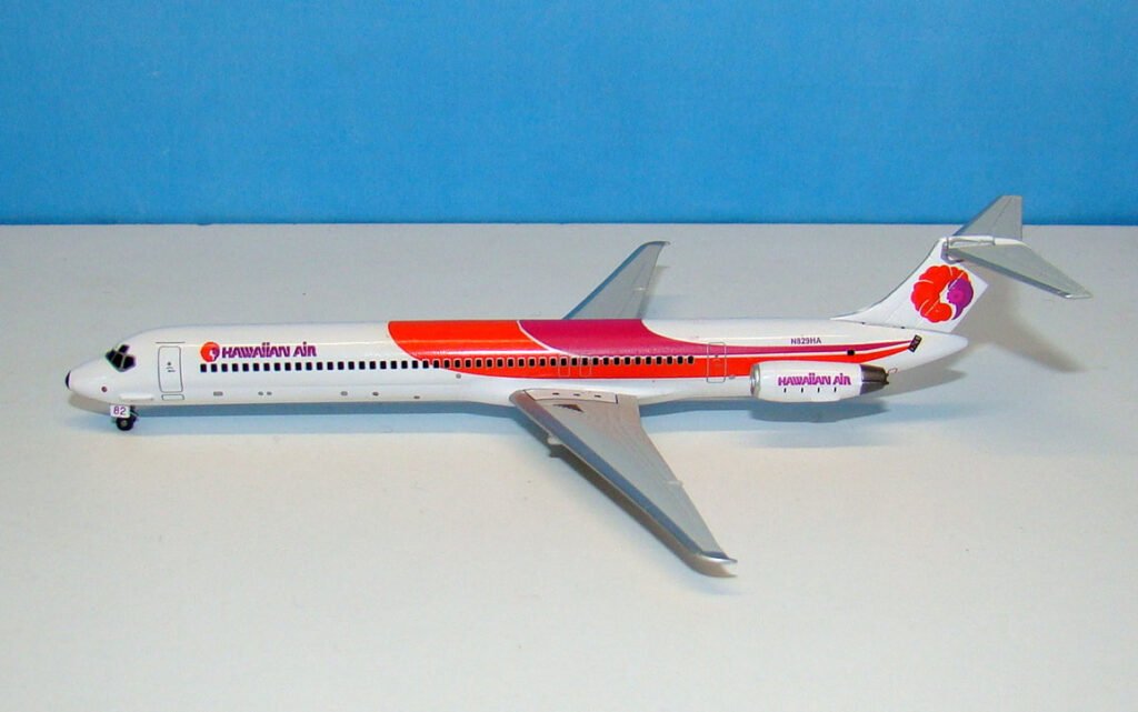
HAWAIIAN AIRLINES (1973)
Sweeps of red and magenta streamline the all white fuselage drawing the eye to the new Pualani ‘flower of the sky’ girl symbol on the tail. The girl is a clever combination of the Hawaiian state flower, the Hibiscus, and a profile of a native girl with a flower in her hair. HAWAIIAN AIR is written in a characteristic unique wordmark.
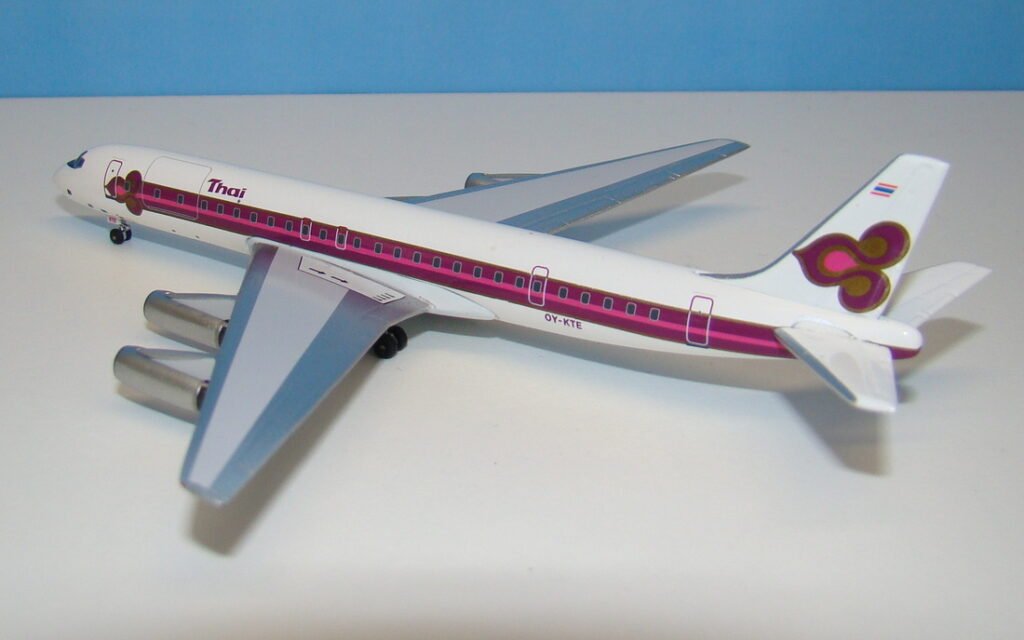
THAI AIRWAYS INTERNATIONAL (1975)
Opulent gold, pink and purple tones recall the gold of Thai temples, the brilliant hues of orchids and the intensity of Thailand’s famous shimmering silks, all incorporated in an enormous stylised orchid symbol on the tail. A smaller orchid tips a gold and purple cheatline, which runs along the whole fuselage.
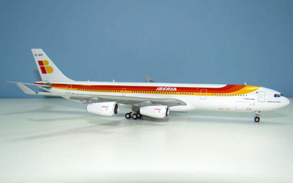
IBERIA (1977)
A bright sunshine combining the red and gold colours of the national flag with an allusion to the country’s holiday attraction. Triple cheatlines of red, orange and gold sweep down from behind the cockpit and along the fuselage. A quartered IB logo in red and gold on the tail carries a royal crown.
ALLEGHENY / USAIR (May 1975/79)

A single horizontal stripe runs along the fuselage beginning in a light shade of red and blending progressively into three darker shades before sweeping up onto the tail and fanning out into all four shades. The new USAir logo replacing the former Allegheny titles in 1979 has a new special A wordmark within it.

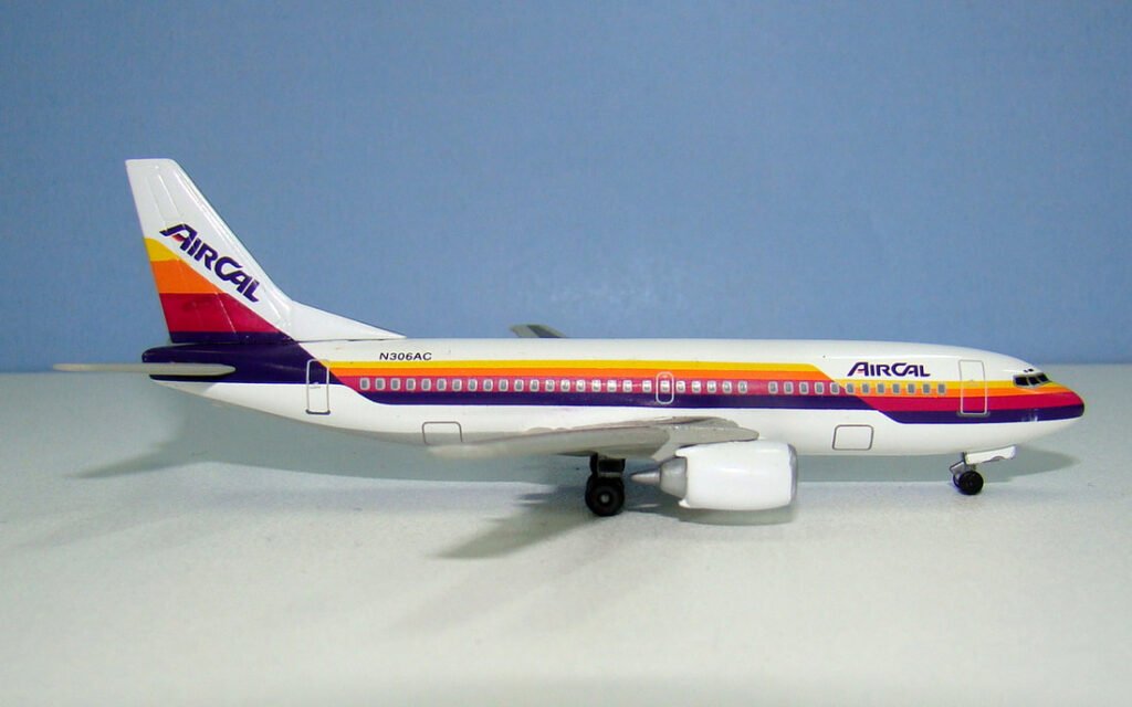
AIRCAL (1981)
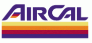
Reflecting the warm Californian sun the AirCal livery featured a four colour cheatline of yellow, orange, red and purple on a white fuselage. The cheatline steps up twice, the last time moving onto the tail in thicker bands of colour. The new AIRCAL wordmark featured a colour band within the A.
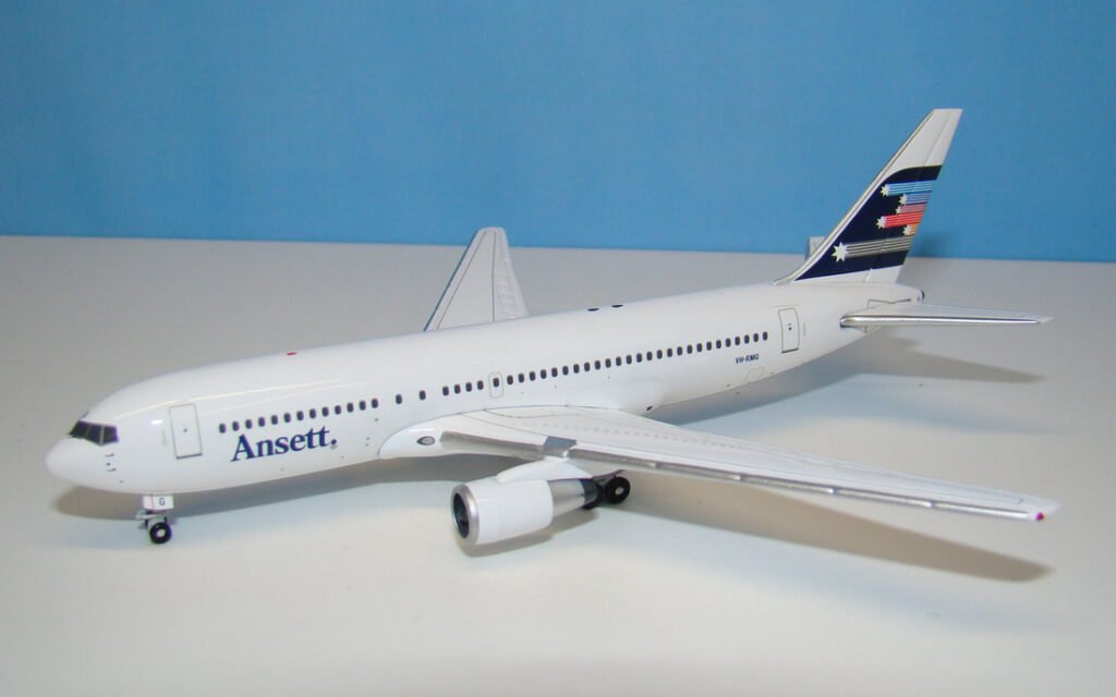
ANSETT (1981)
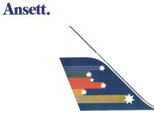
An all-white fuselage with low Ansett titles provides a juxtaposition to a powerful tail with 6 streaming stars representing the Southern Cross constellation on a deep blue background.
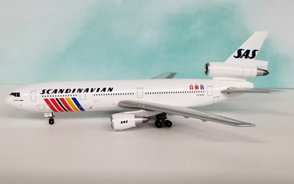
SAS SCANDINAVIAN AIRLINES SYSTEM (1983)
A rhombus in the national colours of the participating nations of Denmark, Norway and Sweden rises from the forward belly on an all white fuselage. Simple Scandinavian titles are outlined in gold as are the SAS initials on the tail. The national flags appear on the rear fuselage in the form of what I always thought were wrapped gifts but are apparently crowns atop the national flags.
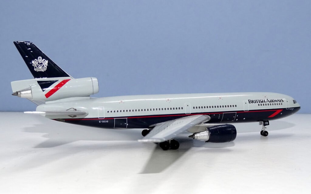
BRITISH AIRWAYS (DECEMBER 1984)
A variation on the previous Negus scheme but the white roof was replaced with ‘Pearl Grey’ and the blue belly replaced with ‘Midnight Blue’. The speedbird was replaced with a ‘Brilliant Red’ speedwing running along lower fuselage. The red tail top replaced by blue with British Airways’ coat of arms within it. The title font was also changed and capitalised. Aircraft remained individually named.
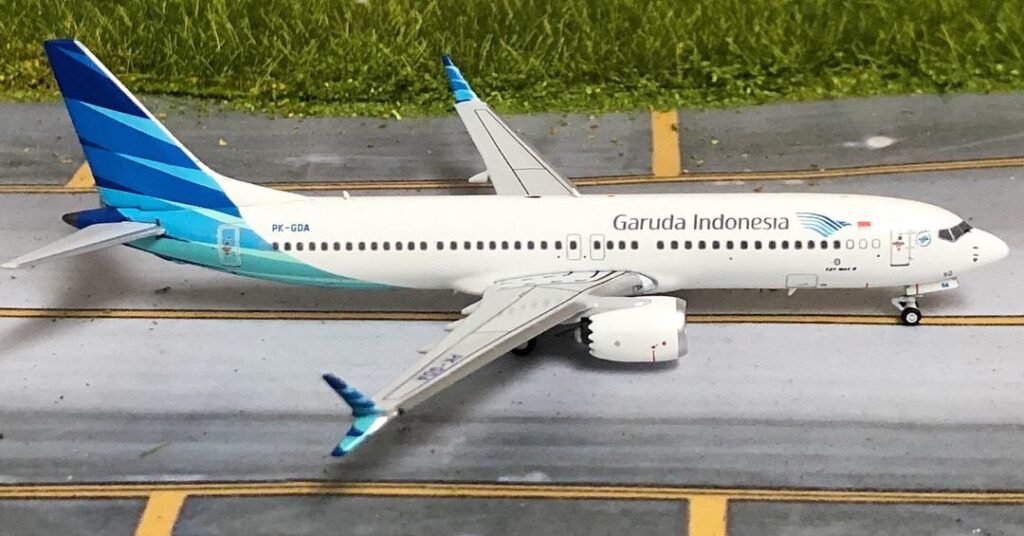
GARUDA INDONESIA (SEPTEMBER 1985)
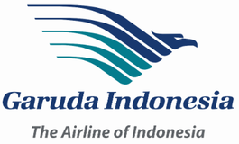
The sacred bird of Hinduism, the Garuda, features on the tail in progressive shades of light blue and turquoise on a dark blue background. The five wing feathers symbolise the five national ideals. The logo also features on an all white fuselage alongside dark blue titles.
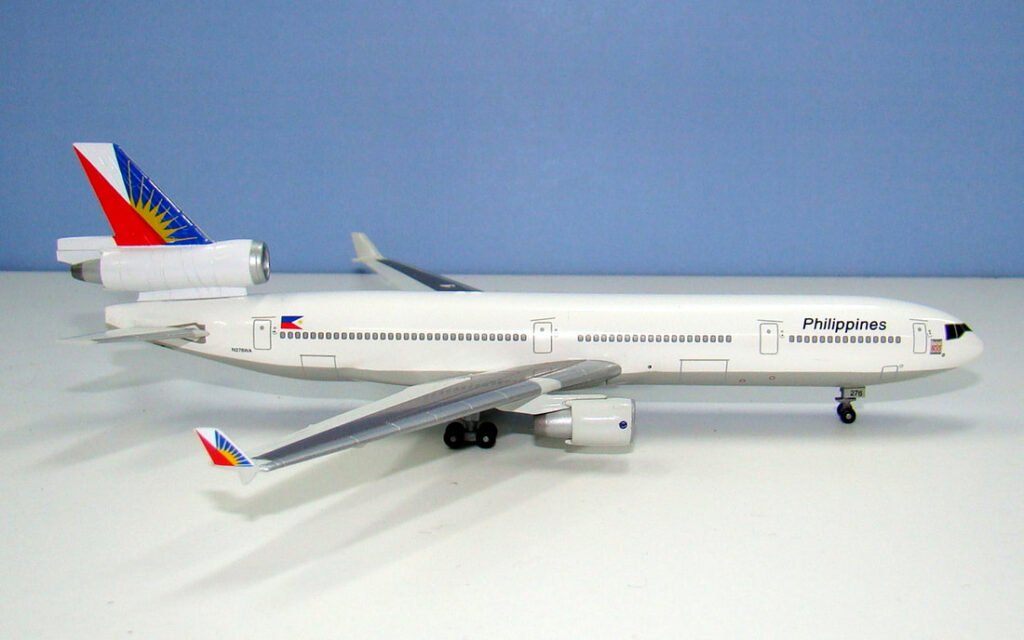
PHILIPPINES (1986)
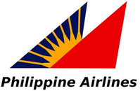
A stylish all white fuselage with solid Philippines titles. The blue, white and red interlocking tail is inspired by the national flag and features a sun burst breaking from the red. The eight rays of the sun signify the first eight provinces to revolt against Spanish rule in 1998.
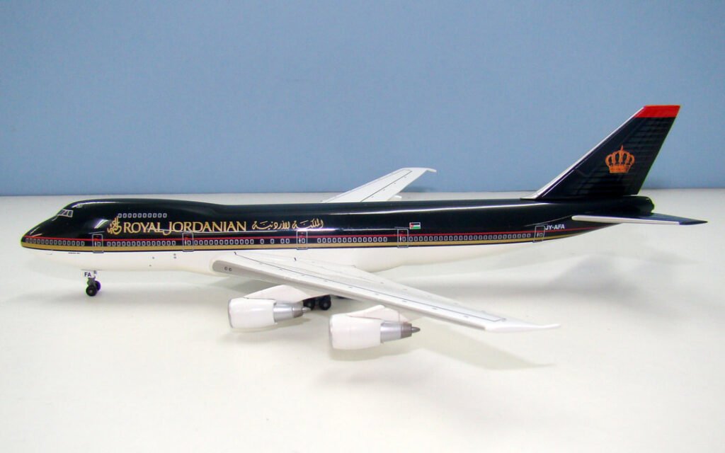
ROYAL JORDANIAN (1986)
Designed to convey a spirit of Jordan’s heritage using majestic gold and red cheatlines along a unique charcoal grey upper fuselage. The gold crown of the Hashemite kingdom dominates the tailfin, which also features subtle tapered speed bands in dark grey and a red tip. Titles in English and Arabic are in gold on the cabin roof.
SINGAPORE AIRLINES (1987)
An update to the original design tastefully bringing it into the late 80s with a new logotype and gold replacing most of the yellow in the cheatline and tail logo. The rear of the tail now also features a gold line in order to communicate precision.

ASIANA (1988)
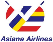
An unusual livery features a white lower fuselage separated from a medium grey upper half (the model below isn’t very accurate with the grey) by a thin blue line. The tailfin is rather empty aside from eight red, yellow, blue and white alternating thin lines up its rear and a small South Korean flag. The main Asiana logo is featured only on the fuselage and consists of what seem like two colourful sails with a stylised face between them.

NORTHWEST AIRLINES (JUNE 1989)
The new logo showed a N logo which had three meanings – either an N, a pointer to the northwest or a W. The red tail is extended along the fuselage roof above a strong grey region, communicating a note of seriousness and efficiency. A deep blue speedstripe underscores the blue offering a sleek modern look. Large NORTHWEST titles in a classical typeface appear in white on the grey.

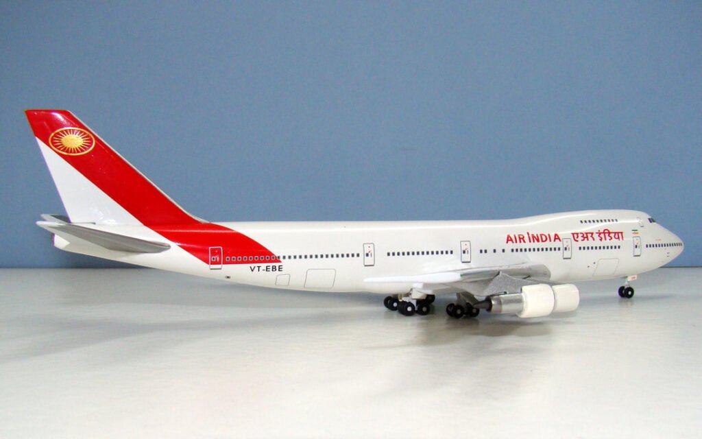
AIR INDIA (OCTOBER 1989)
The new symmetrical sun logo has 24 rays signifying the hours of the day. The golden rays are enclosed in a gold ring. The sun is positioned within a deep red ambassadorial sash extended from the tail onto the rear fuselage. The titles are in Hindu and English in red on a white fuselage with a metallic gold shadow.
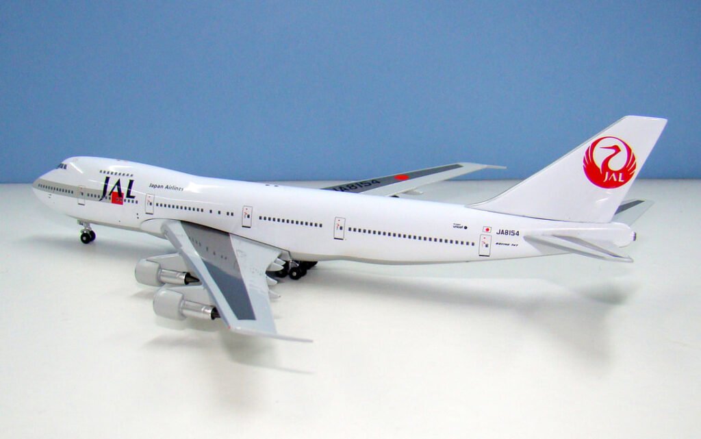
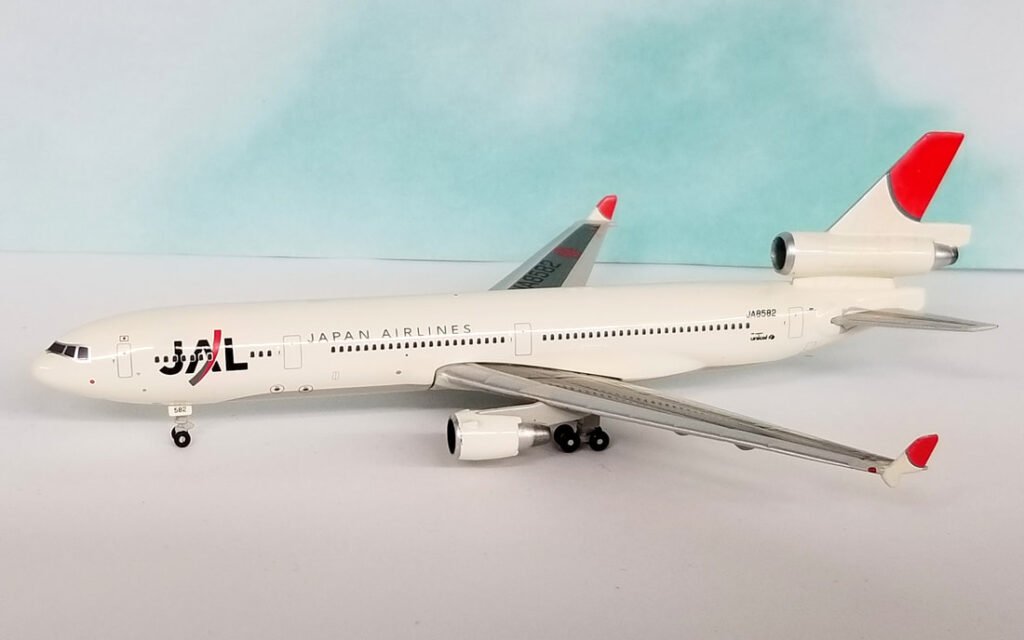
JAPAN AIRLINES (1991)

A fusion of the JAL letters with a red square and grey band feature on the fuselage. The ‘Tsuru’ crane was retained on the tail but with a new stylised JAL lettering incorporated within it. The straight standing JAL letters express dedication and reliability, the red square symbolises the further strengthening of JAL with the burning enthusiasm of youth and energy. The grey band indicates a sense of vibrancy and the spirited and speedy stance taken in meeting future challenges.
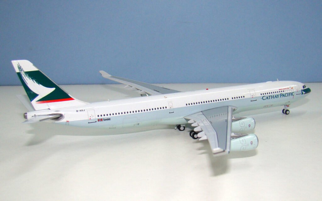
CATHAY PACIFIC AIRWAYS (AUGUST 1994)

Centrepiece of the design is a brushwing logo, a calligraphy stroke suggesting the wing of a bird, against a green background taking up most of the fin and appearing in smaller form under the cockpit. A red speedbar encloses the bottom of the logo. The brushwing symbolises modern energy and confident elegance representing technical excellence and exacting standards of service.
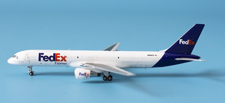
FEDERAL EXPRESS (1994)
Introducing the new FedEx name and logo, cleverly showing the name and a hidden arrow symbolising the company’s speed and efficiency. The new typeface is more dynamic with a bold sans typeface and purple and orange hues. The rear fuselage has an all purple tailfin with the FedEx logo in white and orange.
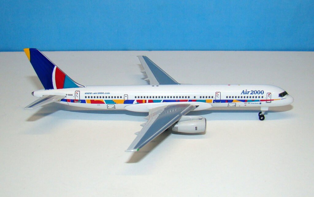
AIR 2000 (1996)
A bright multi-coloured tapestry style arrow tapers towards the nose underneath the window-line. A representation of it continues on the tail using the yellow, blues, green and red of the First Choice logo.
VARIG (1996)

A dark blue belly sets off an otherwise white fuselage with large dark blue sans font VARIG titles and golden script Brasil. A golden compass logo shows the cardinal points on the tail over a dark blue background.

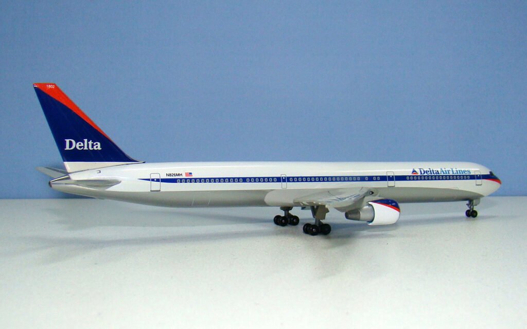
DELTA AIR LINES (1997)
A relatively restrained redesign of the classic widget scheme with a new cheatline tapering at the rear fuselafe and red sweep at the nose. Full Delta Air Lines titles stand next to the standard Widget. The tail has two triangles, one red and one dark blue with Delta titles.
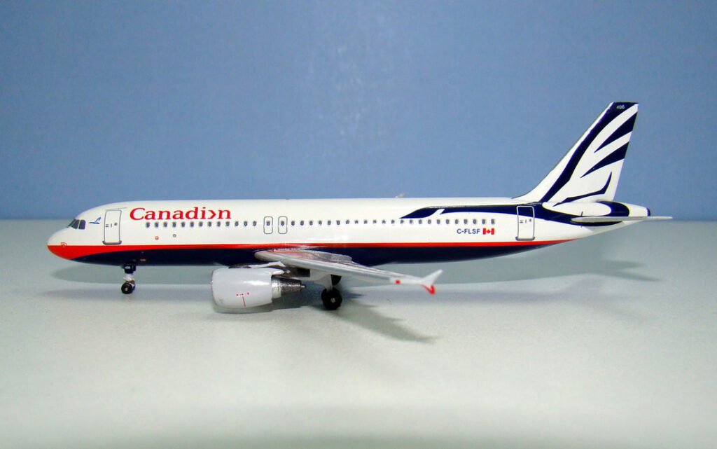
CANADIAN AIRLINES (JANUARY 1999)

Representing Canadian’s core values of confidence, friendliness, professionalism and customer care the Proud Wings scheme introduced a huge Canada Goose tail logo with the body of the goose on the rear fuselage, harking back to the old Canadan Pacific. A deep blue belly is split from the white upper fuselage by a red stripe that expands towards the nose.
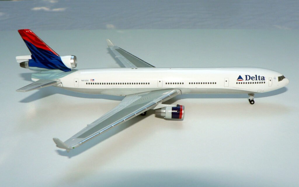
DELTA AIR LINES (2000)
A plane white fuselage with a wide silver belly and a new ‘Soft Widget’ next to large Delta titles. The tail exhibits a ‘Colors in Motion’ effect of a flag being waved with varied colours of red, dark blue and light blue.
BRITISH MIDLAND BMI (FEBRUARY 2001)

The livery change also brought about a name change to BMI British Midland and a new patriotic scheme featuring a royal blue fuselage and tail top with red splashes on the engines and winglets. On the plane’s royal blue tail the “bmi” logo was printed in white with a Union Jack superimposed underneath the colour.
The light blue “bmi” logo had the words “british midland” spelt out in white above the initials.

JAPAN AIRLINES (2002)

JAL’s 2002 livery was controversial as it retired the tsurumaru crane design in favour of what was called ‘The Arc of the Sun’. The JAL acronym remained, but it was changed to include a curved bar, which replaced the simple red square and gray rectangle used from 1989. The bar had red on the front of the bar and the silver replaced the gray entirely. It was likened to a samurai sword. The tail now featured a quarter sun outlined in silver.
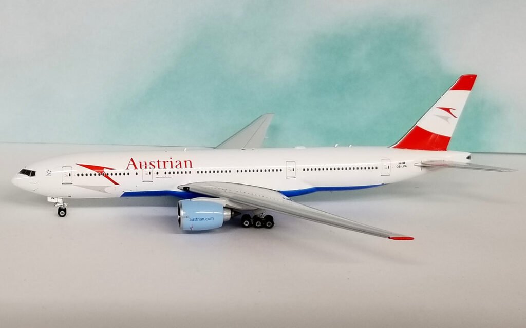
AUSTRIAN AIRLINES (2003)

The traditional Austrian chevron logo was reimagined in a more dynamic assymetric style complete with drop shadow underneath it. A new introduction was the light blue belly and engines. This attractive scheme lasted until March 2015 when a simplified version without the blue belly was adopted.
GULF AIR (2003)
A superbly attractive and bold livery featured a golden forward fuselage with silver and blue striping demarcating it from the rest of the white body. A reimagined golden falcon adorned the tail. The livery was used for 15 years until being replaced in 2018 by a much blander scheme.

SONG (2003)

Song’s livery was certainly a departure from its parent Delta. A lime green stream-style mark wrapped around the fuselage. The colour was repeated on the tail with white song titles and the logomark once again.

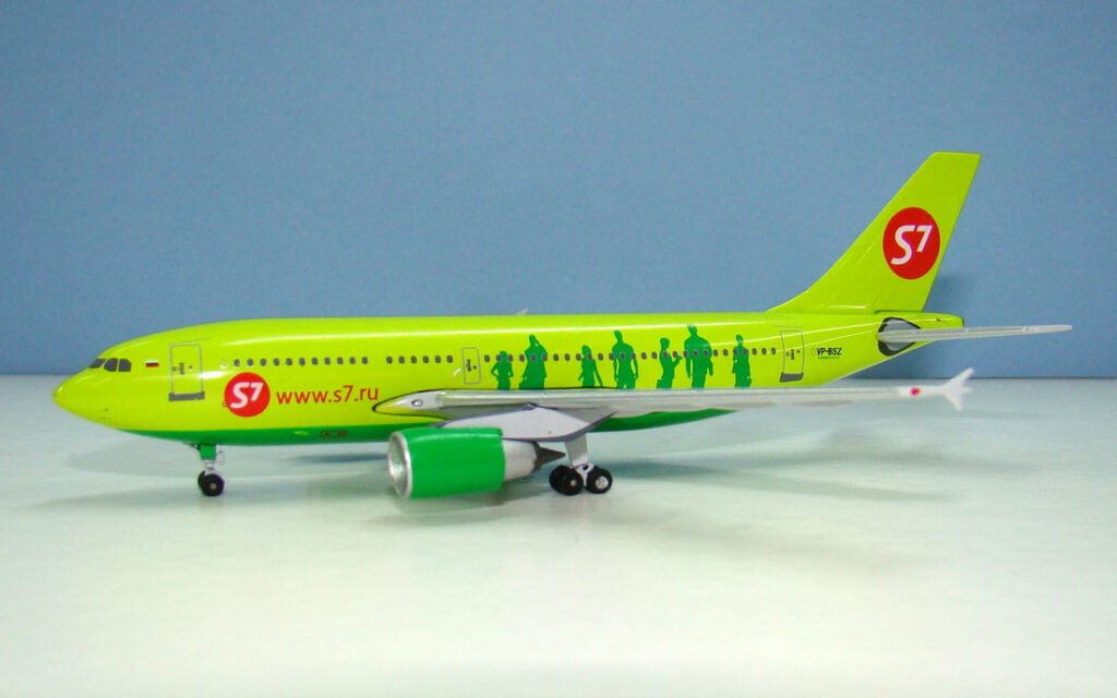
S7 AIRLINES (2005)

Refreshing the Sibir brand using the airlines S7 identifier and a new bright green base colour. A darker green belly and engine complements this with business people silhouetted in the same green against the lighter green.
GARUDA INDONESIA (2009)
This scheme is named ‘Nature’s Wing’ inspired by the wings of tropical birds as well as the ripples of waves upon the water. The bird symbol designed by Landor 24 years earlier remains as the logo, with minor changes, while the logotype now uses a font similar to Myriad Pro. The new look is expected to be able to “Capture the Spirit of Friendliness and Professionalism of Indonesia”.
ALITALIA (2015)

The following text is from a Landor press release:
“To reflect longevity and the airline’s illustrious history, the stylised tail logo which has characterised Alitalia since its first major rebrand 46 years ago has been updated and refined, retaining the same green, red, and white colours of the Italian flag. The new logotype has been modernised and a more dominant “A” has been introduced—a bold statement of the heights the airline is striving to reach and its enviable experience in the field of aviation.
By increasing the number of primary colour tones used on the logo’s palette, the modernised livery now portrays greater depth and richness. Inspired in part by the striking lines on Formula 1 racing cars, striations have been added to the red triangular interior of the Alitalia “A,” creating a pinstripe effect which reflects exclusivity, attention to detail, and a strong focus on design.”
