
American Airlines is renowned for keeping its classic Red, White and Blue scheme from 1968-2013 but the livery before it didn’t have such a long-term impact. Whilst investigating some aspects of American’s history I chanced across some more information on the Astrojet scheme that pre-dated the 1968 livery and so I thought I’d pull together a quick post on the topic.
AA was inspired to rename its aircraft Astrojets by the advertising agency Doyle Dane Bernbach. The same agency had at the time recently turned the Volkswagen Beetle from an ugly German car into a cult counter-culture classic.
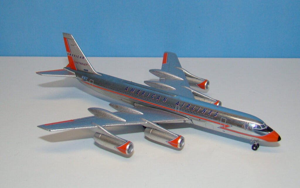
The Convair 990s were the first aircraft in the fleet to be called Astrojets rather than Flagships but this was prior to the adoption of the new livery. In fact, the new American Airlines logo was adopted in advertising material well before the livery was changed.
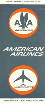
Below: This April 1963 timetable featured the new logo.
The new logo placed the double A above American titles with the Eagle between the AA and all of this inside a white ellipse with red rim. It was a rather full-on design. This new emblem could be seen on timetables and posters from 1962 but always in combination with the former Jet Flagship scheme.
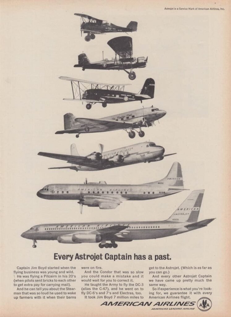
Below: This 1963 advert features the new logo but previous Jet Flagship scheme still
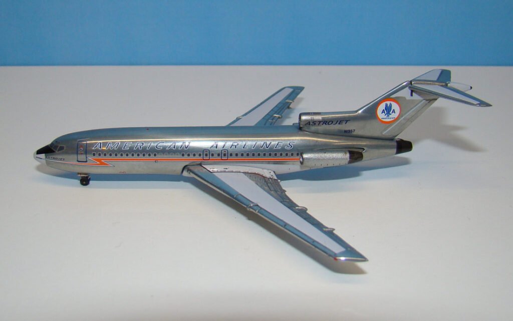
It seems it wasn’t until the delivery of the first 727-023 in January 1964 that the full new livery and logo were put on the actual aircraft. The new ellipse logo was placed on the tail and the lightning bolt on the fuselage modified to a pointed end. The titles were also streamlined. The new colours were officially international orange and astrojet blue.
Apparently one of the reasons C.R. Smith was ok with all the changes was that his brother Bill had joined AA as director of corporate design. He sought the advice of the design firm Visual Marketing Inc. and their opinion was that American had too many variations in visual identification. This is what led to the adoption of the new logo as the main livery feature and the retirement of the previous orange markings.